Remarkable Revamps
Remarkable Revamps: 5 Renovation Projects to Inspire your Next Home Makeover
.cx.jpg)
No. 1: Fairy Tale Cottage
Photographs by Heather Radford
When architect Amy Conner-Murphy and her team from ACM Design took up the task of renovating the adorable North Asheville cottage of Doug and Wendy Banks, they gave it a fitting nickname: The Sleeping Beauty Project. “It was a diamond in the rough,” says Conner-Murphy. “Every time we pulled back a layer, we were able to reveal the true nature of what that little home was supposed to be.”
Noted for designing Asheville’s Jackson Building, the region’s first skyscraper, E.A. Jackson built the house for his daughter in 1925, replete with a rolled-edge roof and round-top door. Though the home had only two owners prior to the Bankses, it had slipped into a dreadful state and required extensive renovation, with the kitchen and bathrooms demanding the most attention. Given the home’s historical significance and location in the nationally registered Grove Park Historic District, Conner-Murphy and the team were challenged to maintain the architectural integrity of the home while offering modern amenities and energy efficiency. They did that by updating the home’s mechanical systems and keeping as many period details as possible. For example, windows were restored rather than replaced, and Shaker kitchen cabinetry and antique pewter hardware were chosen to reflect the period, lending a look that’s as timeless as the home itself.
What they Did:
1. Redesigned the kitchen and breakfast nook to create a large galley kitchen with modern appointments and appliances.
2. The master bath was redesigned with period styling to accommodate a large shower and dual sink vanity.
3. The entire interior was renewed by refinishing the wood floors, repairing plaster, painting, and adding period-style lighting.
4. The exterior was refreshed with paint and copper gutters that are exact replicas of the originals.
5. The overgrown landscape was cleared and redesigned to open up the property and allow natural light into the home once again.
Get This Look
ACM Design
(828) 684-9884
www.acmdesignarchitects.com
Cabinetry & Countertops
Heritage Kitchens
www.heritagekit.com
Ceramic Tile Supplier
Crossville Tile & Stone
crossvilletileandstone.com
Ceramic Tile Installation
John Miller
(828) 316-9629
Window Treatments
InteriorDesign, Inc.
(828) 712-4494

No. 2: Historical Attraction
Photographs by Kevin Meechan
With their children out of the house, Tracy and Scott Buchanan, both executives at CarePartners in Asheville, found themselves re-evaluating their nest. Yet, having spent 22 years raising their family in the 1920s fieldstone house in Asheville’s Bent Creek neighborhood, they opted to stay put, and worked with Nathan Bryant and Brooke Tate of Samsel Architects to transform the home into one they could live in for the long haul.
The Buchanans love hosting large gatherings, but the house, which was originally built as two stone cottages and bridged together in the 1930s, wasn’t conducive to congregating. The kitchen was small, and the living room narrow. The easy solution would have been to extend the backside of the house, though that would have meant removing one of the largest white oak trees in Buncombe County, which is positioned a mere six feet from the kitchen window. Sacrificing it was out of the question. “If anything happened to that tree, it would be like a death in the family,” says Tracy. “It was one of the most important things to preserve in this project.”
As a compromise, a large portion of the house adjacent to the kitchen was demolished so the kitchen could be expanded in that direction. The dining room was moved for a better flow, and even the living room received an air of openness with the addition of a bay window. The tree stayed, and thanks to help from an arborist, is in even better condition than it was before.
The Samsel team preserved the historical character of the house by keeping many elements intact or repurposing them elsewhere and making design choices that reflected the era. “I don’t think you would walk into this house and say this used to be something different and now it’s something new,” Bryant says. “It pays homage to the original character of the house in a more open, spacious, and comfortable way.”
What they Did:
1. Doubled the size of the kitchen to provide better circulation and installed expansive windows for more light. A screened porch now extends off the kitchen.
2. The dining room, which is now a parlor, was relocated into the rear addition, where large windows were added. It’s connected to the new kitchen and opens to the living
room as well.
3. A bay window was added to the narrow living room to make the space feel bigger.
4. A new front porch that harkens to the era of the original structure was added for protective cover and to offer a more inviting entry.
5. Great care was taken to protect and improve the longevity of the massive oak tree out back, a defining characteristic of the property.
Get This Look
Samsel Architects
(828) 253-1124
www.samselarchitects.com
General Contractor
Wilson Construction Company
(828) 691-0377
Cabinetry
Architectural Woodcraft
www.architecturalwoodcraft.com
Landscape Contractor
Snow Creek Landscaping
www.snowcreekinc.com

No. 3: Artistic Endeavor
Photographs by Michael Oppenheim
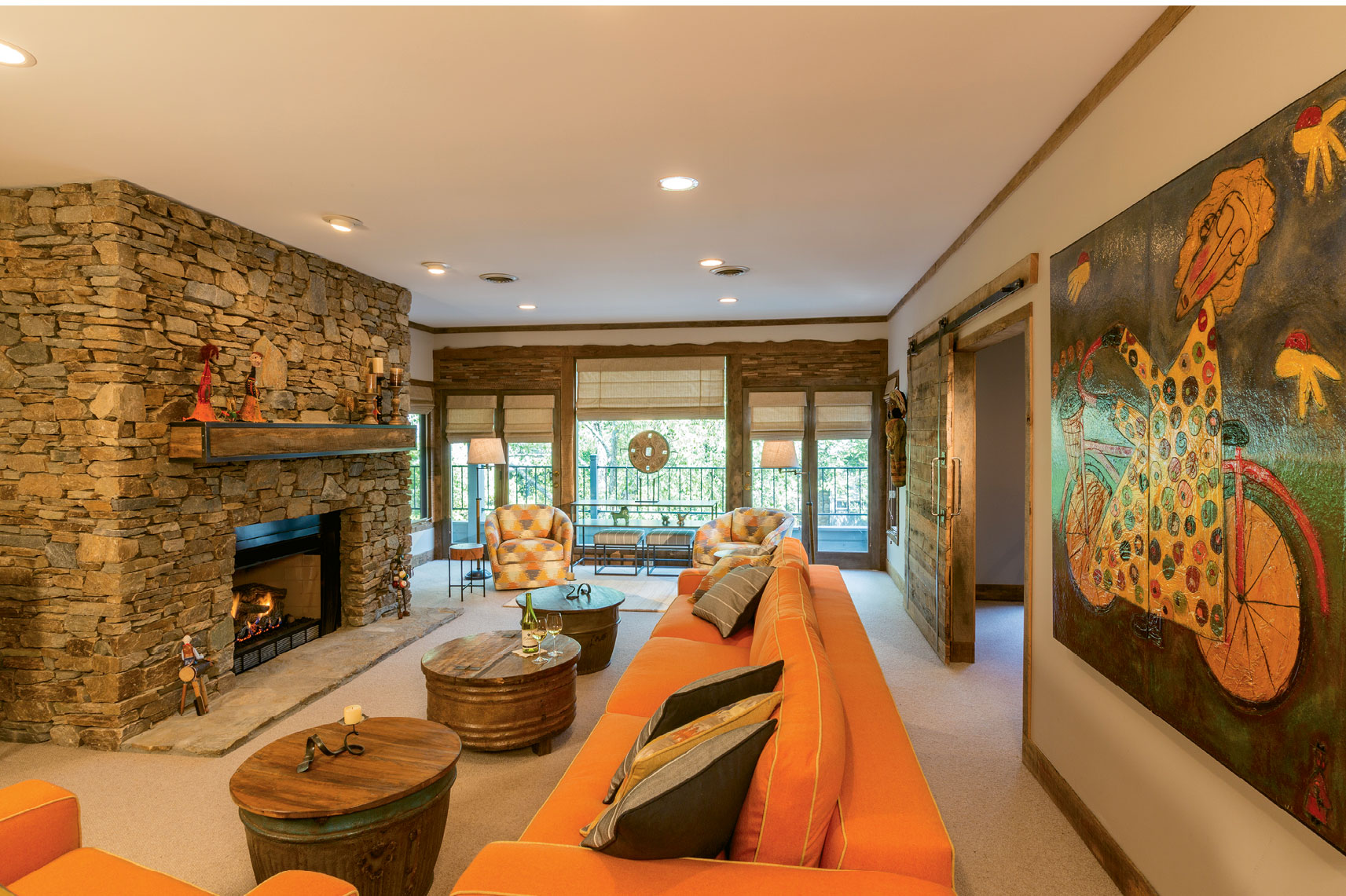
The remodel of Marty and Claudia Pols’ dated 1980s Asheville condo didn’t require extensive reconfiguration of walls, but rather a creative overhaul that involved a handful of local artisans. For the task, they hired WSM Crafts’ Smith McAulay, a contractor and builder who specializes in artisan design work. He brought in several craftspeople to help give the space new personality. It was an ideal match for the Pols, who are art collectors. Claudia is involved in the art scene in Huntsville, Alabama, where the couple lives most of the year. “They wanted this funky, contemporary, folk art look,” says McAulay, and “gave us a good amount of artistic autonomy.”
McAulay offered a proposal that involved using barnwood in a contemporary aesthetic, and hit the jackpot when he purchased some 1,500 linear feet of reclaimed oak and locust from Olde Town Salvage in Leicester. He and his team, Brad Migyanka and Red Deer Cruz, used it to build a bedroom shelving/nightstand unit, bathroom vanity, and sliding door in the living room, and to accent the doors and windows throughout. Even the wood scraps were used in the mosaics over the windows. Leslie Huntley of Roost Interiors developed concepts for lighting fixtures and furnishings, and Anna Krauss put her faux finish painting skills to work bringing the barnwood look to the doorjambs, window trim, and kitchen cabinetry. The result is a comfortable home with a strong touch of artistry.
What They Did:
1. Three bathrooms were renovated and updated, and a master closet was reconfigured for more space and functionality.
2. The popcorn ceiling and Parquet flooring were removed.
3. Reclaimed wood was used to make a custom vanity, sliding door, mantel, and shelving/nightstand unit, and was incorporated into the window mosaics and molding
throughout.
4. The kitchen cabinets were made new with a faux finish, as were the window trim and doorjambs so that they blended with the wood molding.
Get This Look
WSM Craft
(828) 337-1957
www.wsmcraft.com
Roost Interiors
www.roostinteriordesign.com
Old Town Salvage Co.
www.oldtownsalvageco.blogspot.com
Red Deer Custom Trim & Stair
(828) 216-9639
Angry Giant Forge
www.facebook.com/angry-giant-forge
Anna Krauss
(828) 713-6603
.cx.jpg)
No. 4: New Point of View
Photographs by David Dietrich
When Cincinnati residents Larry and Kim Juran were looking for a second home in Asheville, they knew they wanted a house near downtown with a view and found just the place on Town Mountain. However, like many of the homes that sit on this commanding ridge east of the city, “it was built during a time when construction methodology was not the greatest,” says architect Rob Carlton of Carlton Architecture, who the Jurans hired to update the 1970s dwelling. The floor plan was haphazard, with the main entry on the lower level opening to an office and stairs that ascended squarely into the center of the upper living area, awkwardly dividing the space. “There was even a bathroom door opening into the dining room,” says Carlton. The project required major demolition to open the upper level and create a modern layout, though Carlton says the house was set up nicely for the overhaul. “The structure has a simple form and had not been modified with bad renovations.” With a fresh, open floor plan, a master suite added to the upper floor, expansive windows, a new deck, and bright burnt orange exterior paint, the home is as spectacular as the view.
What They Did:
1. Downstairs, one of four bedrooms was sacrificed to expand the foyer, the stairs were relocated, and a dumbwaiter for hauling in groceries was added in the garage.
2. Upstairs, the kitchen, dining room, and bathrooms were reconfigured to create an open, modern layout.
3. The fireplace was resurfaced with steel panels and flanked by white oak cabinetry.
4. A master suite, utility room, powder room, and pantry were incorporated into the upstairs footprint.
5. Windows were replaced throughout, with the upper level receiving new floor-to-ceiling views.
6. The wood deck was replaced with a steel structure that offers unobstructed westward views.
Get this Look
Carlton Architecture + DesignBuild
(828) 274-7554
www.carltonarchitecture.com

No. 5: Raise the Roof
Photographs by Michael Oppenheim
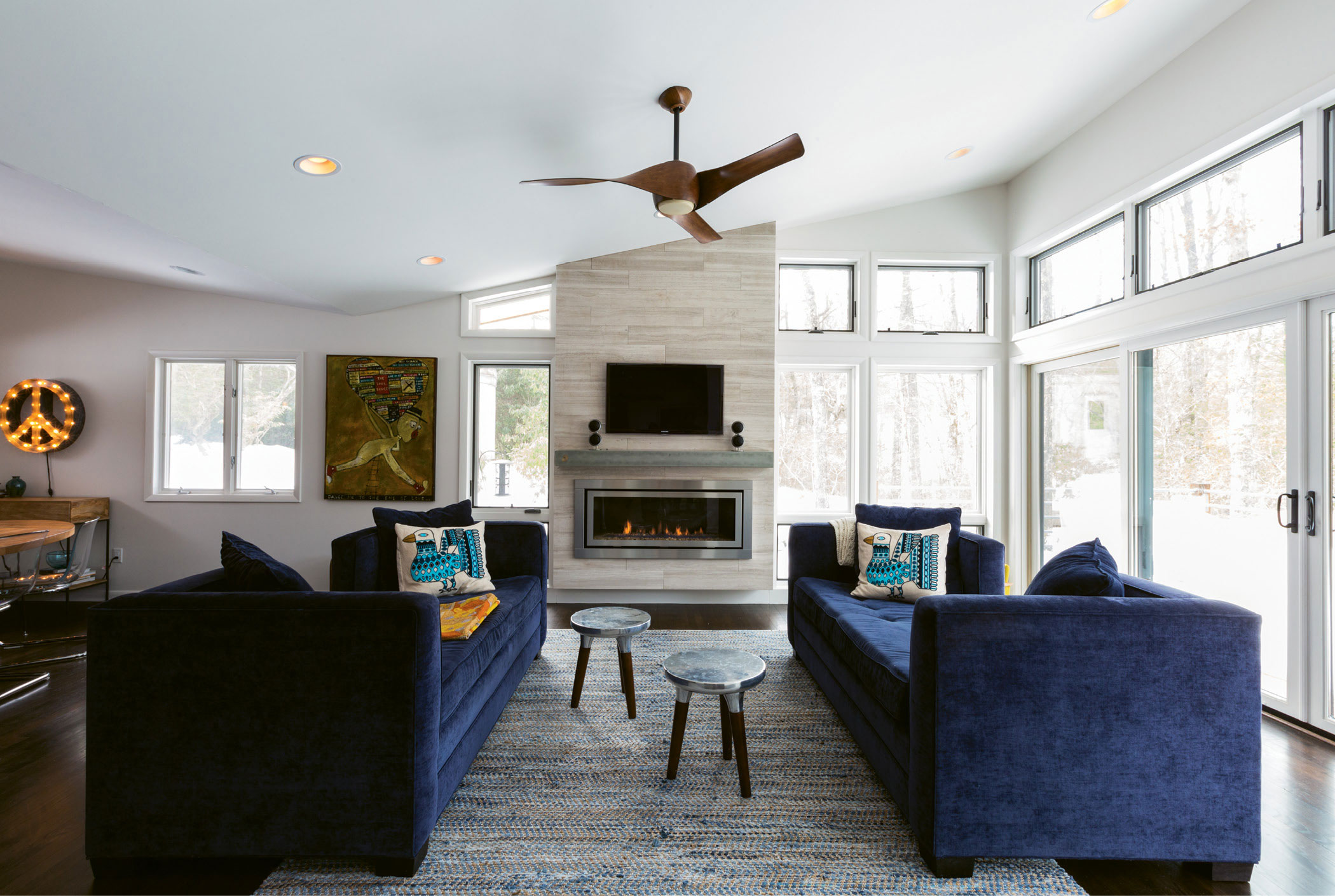
Scott Kaysen and Julie Chavez’s vacation home in a forested community near Brevard went from a demure 1970s rancher to a mid century modern-inspired beaut. The key to their success? They raised the roof. The house had an understated entry, minimal windows, and eight-foot ceilings that resulted in a dark interior, explains architect Peter Tart. Adding a butterfly roof gave the house breathing room and increased the opportunity for expansive windows. It also helped make the approach feel more welcoming. The kitchen received an extensive renovation as well. “It was a terrible 1970s kitchen,” says Tart. “Back then, kitchens were used for utility and weren’t places for gathering.” His team opened up the entry from the living room, increased the size, and added skylights. A wall concealing access to the downstairs was redesigned so that a half wall is neatly incorporated into the kitchen layout. And the downstairs, which Tart says “was like a netherworld,” now benefits from the skylight too. Renovations in the master bedroom and baths helped make this a dream getaway for the Charlotte couple. There’s even has a domed observatory on the property—but that’s a project for later.
What They Did:
1. Increased the ceiling height by introducing a butterfly roof that allowed for larger windows and broader views of the surrounding forest.
2. Expanded the roof to cover the entry and better integrate the porte cochere into the overall design. The soffit’s natural wood color is a warm touch.
3. The kitchen ceiling was raised, and skylights were added. The space was lengthened, and the entry from the living room enlarged. Access to the deck was improved.
4. Previously accessed via a dark hallway adjacent to the kitchen, the lower level was opened up by tearing down the door and wall, and placing the skylight over the stairs.
5. The master bedroom received larger windows to better connect with the outdoors, and the bathrooms were remodeled.
Get This Look
Peter Tart Architect
(828) 412-1289
www.petertart.com
Contractor
Eric Stevenson
(828) 803-2312
